Naver
Simplifying access
to daily essentials.
Client
Category
Service
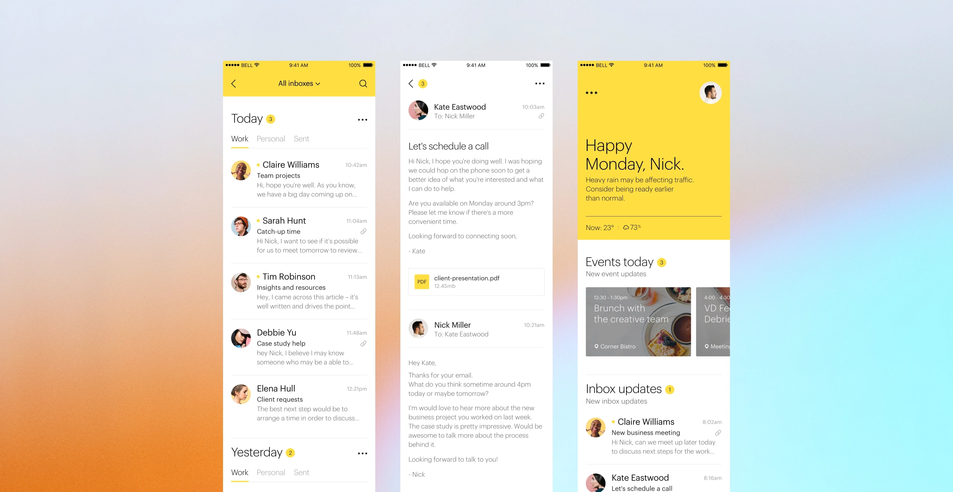
Naver is used by more than 50% of Korea’s population, with over 27 million users using its services everyday. The goal of the project was to help bring together its different services – calendar, email and contacts – into a single app for an easier and faster access to the things they use most.
For every moment, not every second.
Email and calendar is for many the first thing they check in the morning. hello. offers a friendly way to greet people everyday when they open the app.
All in one place.
hello. combines contacts, email and calendar into a seamless experience so you can easily see all the information you need in one place.
Glance and go.
hello. highlights what’s important for you so you can focus on what’s ahead and prepare for future events or reminders.
What's next.
Review your day and prepare for what’s next with a short summary of your daily activities. hello. summarizes your achievements and reprioritizes upcoming activity.
Chatbot style onboarding.
It all starts with an onboarding flow with chatbot integration that makes more intelligent content decisions based on interests and preferences.

The same experience on the Apple Watch.
Smart reminders, intelligent schedule handling with suggested calendar gaps and venue suggestions based on past activity.
More work
Shophouse
Product Design
Bearaby
A refreshed digital identity
embracing wellness and comfort.
Website Design


